




Google Prepares Wear OS for Pixel Watch 5 Launch with Significant App Icon Redesigns

As the technology world anticipates the official unveiling of Google’s next-generation smartwatch, the Pixel Watch 5, alongside the highly anticipated Pixel 11 series, scheduled for next Wednesday, a notable development has emerged from within Google’s Wear OS software portfolio. Ahead of the new hardware and the expected debut of Wear OS 7, Google has begun rolling out refreshed designs for several core Wear OS applications, signaling a broader commitment to refining the user experience and modernizing its smartwatch platform. These aesthetic enhancements, initially spotted by users, suggest a strategic move by Google to present a cohesive and polished ecosystem as it prepares for its major product launch.
The recent changes, first highlighted by X user Joe Lenington, showcase updated icons for the essential Clock and Stopwatch applications on Wear OS devices. This follows a trend of design refinement observed across Google’s various platforms and applications, underscoring a consistent effort to align its digital presence with a unified visual language. The timing of these updates, preceding the Pixel Watch 5’s launch, is particularly significant, suggesting a concerted effort to optimize the software experience to complement the new hardware.
A Deep Dive into the Redesigned Icons
The most substantial transformation among the recently updated icons is evident in the Clock app. The previous iteration, characterized by a more traditional and somewhat dated appearance, featured prominent alarm bells that contributed to a "goofy" aesthetic, as described by early observers. The new design ushers in a sophisticated and streamlined look, moving away from the overt alarm imagery. The alarm bells are now significantly less prominent, almost subliminal, allowing the watch face itself to become the focal point. This shift in emphasis creates a cleaner, more modern icon that aligns with contemporary minimalist design principles.
Furthermore, the revised Clock icon adopts the classic 10:10 hand positioning, a widely recognized convention in watch advertising and display. This specific time setting is meticulously chosen for its aesthetic balance, ensuring that the watch hands do not obscure the brand logo (if present) or other key design elements, and that they create a visually appealing symmetry. By incorporating this industry standard, Google elevates the icon’s perceived quality and professionalism. The tweaked color palette, featuring a darker overall appearance, further enhances this premium feel, providing a sleek contrast that is both contemporary and easy on the eyes. This darker theme also aligns with the growing popularity of dark modes across various operating systems and applications, which are often preferred for their reduced eye strain and perceived energy efficiency on OLED displays, common in smartwatches. The collective changes transform the Clock icon into what many perceive as a legitimate and much-needed upgrade, reflecting a maturation of Google’s design philosophy for Wear OS.
The Stopwatch app also receives attention, albeit with more subtle modifications. While the core design structure remains largely intact, the update primarily focuses on a refreshed color scheme. The previous design, while functional, now appears almost like a "negative version" when compared to its new counterpart. The new colors inject a vibrant yet understated energy into the icon, making it feel more modern and integrated with Google’s broader Material You design language. This subtle enhancement demonstrates Google’s meticulous attention to detail, ensuring that even minor elements contribute to an overarching sense of polish and consistency across the user interface. These changes, though not as dramatic as the Clock app’s overhaul, contribute significantly to the overall refreshed look and feel of the Wear OS ecosystem.
Google’s Broader Design Overhaul: A Strategic Context
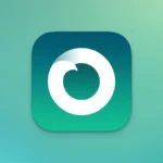
These recent icon updates for the Clock and Stopwatch apps are not isolated incidents but rather part of a larger, ongoing initiative by Google to modernize its entire application iconography. This trend was evident as early as June, when Google rolled out a new icon for its ECG (electrocardiogram) app on the Pixel Watch. That particular update brought the ECG icon in line with a more uniform and stylized aesthetic, signaling the start of a comprehensive design refresh for its smartwatch applications.
The rationale behind such widespread redesigns is multifaceted. Primarily, it aims to establish a consistent visual identity across Google’s diverse product ecosystem. With the advent of Material You, Google’s adaptable design system that personalizes app aesthetics based on user preferences and wallpaper, there’s a strong emphasis on fluidity, vibrancy, and user-centric design. Updated icons play a crucial role in this paradigm, ensuring that applications feel integrated and cohesive, regardless of the device or platform.
Moreover, a refreshed icon set can significantly enhance the user experience. Modern, visually appealing icons improve navigability, make the interface feel more intuitive, and contribute to a premium perception of the software. In a competitive market like smartwatches, where user interface and overall aesthetic play a critical role in consumer choice, these design improvements can be a differentiator. They signal to users that Google is actively investing in and refining its Wear OS platform, moving it beyond a purely functional offering to a more aesthetically pleasing and user-friendly experience.
Industry analysts suggest that these continuous design updates are a strategic move by Google to fortify its brand identity and enhance the perceived quality of its software. In an era where digital aesthetics are paramount, a unified and modern icon set helps in reinforcing brand recognition and user loyalty. This is especially pertinent for Wear OS, which has undergone significant transformations in recent years to compete more effectively with established players like Apple’s watchOS.
The Pixel Watch 5 and Wear OS 7: A Symbiotic Launch
The imminent launch of the Pixel Watch 5 alongside the Pixel 11 series next Wednesday serves as a crucial backdrop for these app icon redesigns. The new smartwatch is expected to ship with Wear OS 7, the latest iteration of Google’s wearable operating system. The timing of these visual updates strongly suggests that Google intends for the new software and hardware to launch with a fresh, polished aesthetic from day one.
Wear OS 7 is anticipated to bring a host of improvements, ranging from performance enhancements and battery optimizations to new features and a refined user interface. The updated app icons are likely just one visible component of a broader UX/UI overhaul designed to make Wear OS 7 a compelling experience. A cohesive design language across the operating system and its core applications is vital for creating a seamless and intuitive user journey, especially for new users adopting the Pixel Watch ecosystem.
The Pixel Watch line represents Google’s direct foray into the premium smartwatch segment, competing head-to-head with the Apple Watch and Samsung’s Galaxy Watch series. For Google to succeed in this highly competitive arena, a robust and refined software experience is just as critical as cutting-edge hardware. By investing in design details like app icons, Google signals its commitment to delivering a holistic premium product that extends beyond specifications to encompass the entire user interaction.
These updates also lay the groundwork for a consistent brand experience across Google’s broader ecosystem. As users interact with Google services on their smartphones, tablets, and smartwatches, a unified visual language helps in creating a familiar and predictable environment, reducing cognitive load and enhancing overall satisfaction. The integration of Material You principles into Wear OS, exemplified by these icon updates, is a testament to Google’s vision for a harmonized and personalized digital experience.
Chronology of Google’s Wear OS Design Evolution
Google’s journey with its wearable operating system has been one of continuous evolution and, at times, significant overhauls.
- 2014: Android Wear is first introduced, marking Google’s entry into the smartwatch market. The initial design language was heavily influenced by Android’s Holo theme, later transitioning to Material Design.
- 2018: Android Wear is rebranded as Wear OS by Google. This rebrand aimed to emphasize its broader compatibility beyond just Android phones and signal a renewed focus on the platform. Design updates during this period focused on improved navigation and glanceable information.
- 2021: A pivotal moment arrives with the announcement of Wear OS 3, developed in collaboration with Samsung. This version brought substantial performance improvements, a redesigned UI, and deeper integration with Fitbit health tracking. The Samsung Galaxy Watch 4 series was the first to feature this new OS, giving it a much-needed boost in competitiveness.
- October 2022: Google launches its first-ever Pixel Watch, running a refined version of Wear OS 3.5. This marked Google’s direct commitment to hardware integration and a more unified ecosystem experience. Subsequent Pixel Watch models (Pixel Watch 2, Pixel Watch 3, Pixel Watch 4) iterated on this foundation.
- Early June (Current Year): The ECG app on Pixel Watch receives a refreshed icon, signaling the beginning of a broader app icon redesign initiative.
- Recent Weeks/Days: Observations of updated Clock and Stopwatch app icons surface, indicating an accelerated pace of design refinements.
- Next Wednesday (Imminent): The anticipated launch of the Pixel Watch 5 and Wear OS 7, where these new design elements are expected to be fully integrated and showcased.
This timeline illustrates Google’s persistent efforts to refine and elevate the Wear OS experience, moving from a nascent platform to a more mature and aesthetically sophisticated operating system. The current icon updates are the latest step in this ongoing journey, directly preparing the platform for its next major hardware and software release.
Implications for the Smartwatch Market
The smartwatch market is fiercely competitive, dominated by Apple with its Watch series, followed closely by Samsung’s Galaxy Watches and a myriad of specialized fitness trackers from brands like Garmin and Fitbit (now owned by Google). For Wear OS to capture a larger market share and appeal to a broader audience, consistent innovation across both hardware and software is paramount.
These design updates, while seemingly minor, contribute significantly to the overall perception of quality and modernity. A polished user interface can be a powerful selling point, influencing purchasing decisions as much as technical specifications. By investing in design consistency and aesthetic appeal, Google is aiming to position the Pixel Watch series and Wear OS as premium offerings capable of competing with the best in class.
Furthermore, a refreshed look can revitalize user engagement. Existing Wear OS users may feel a renewed sense of excitement and commitment to the platform when they see continuous improvements and modernizations. For potential new users, a sleek and intuitive interface can lower the barrier to entry and make the experience more appealing.
In essence, Google’s meticulous attention to app icon redesigns is more than just a superficial facelift. It is a strategic move to reinforce its brand identity, enhance user experience, and prepare Wear OS for its next major evolutionary leap with the Pixel Watch 5 and Wear OS 7. These updates signify Google’s ongoing commitment to building a robust, visually appealing, and competitive ecosystem in the burgeoning wearable technology market. As the launch date approaches, the tech community will be keenly observing how these aesthetic refinements integrate with the new functionalities and hardware capabilities of Google’s latest smartwatch offerings.