





Google Keep Poised for Major Organizational Overhaul with New Navigation Filters and UI Refinements Discovered in Latest APK Teardown

Independent analysis of the Google Keep application for Android, specifically version 5.26.461.01.90, has unveiled a suite of forthcoming features designed to significantly enhance note organization and user interface. These discoveries, stemming from an APK teardown, indicate Google’s potential move to introduce intuitive navigation filters and subtle yet impactful UI adjustments, promising a more streamlined and efficient experience for its vast user base. While the nature of APK teardowns means these features are still in development and their eventual rollout is not guaranteed, the findings suggest a renewed focus on improving the core functionality of Google’s popular note-taking service.
Unveiling the New Navigation Filters
The most prominent discovery involves the integration of a new set of navigation filters, strategically positioned directly beneath the main search bar within the Google Keep interface. This addition represents a significant departure from the current primary methods of note retrieval, which largely rely on manual keyword searches or pre-assigned labels. The identified filters include "All," "This Week," "To-Dos," "Shared," and "Lists," each designed to segment and display notes based on specific criteria, thereby reducing the cognitive load and time associated with locating particular information.
Upon activation, these filters promise to transform how users interact with their note repositories. The "All" filter, intended as the default view, will continue to present a comprehensive collection of notes, with pinned notes maintaining their priority at the top, followed by the most recently created or modified entries. This ensures continuity for users accustomed to the existing display while providing immediate access to the new organizational tools.
A Closer Look at Each Filter’s Utility
The granular functionality of each new filter addresses distinct user needs and common note-taking patterns:
- "This Week": This filter offers a temporal dimension to note organization, displaying only notes that have been created or modified within the current seven-day period. For professionals tracking daily tasks, students managing weekly assignments, or individuals keeping tabs on recent personal reminders, this filter could prove invaluable. It eliminates the need to manually sift through older notes, providing an immediate snapshot of current priorities and activities. In an increasingly fast-paced digital environment where information churn is constant, a quick temporal filter can significantly enhance immediate recall and actionability.
- "To-Dos": Arguably one of the most anticipated additions, the "To-Dos" filter is designed to aggregate all notes associated with tasks, reminders, and checklist formats. Google Keep has long been a popular choice for quick task management due to its simplicity and integration with Google Assistant. However, distinguishing a simple note from an actionable to-do item within a large collection has often required meticulous labeling or search queries. This dedicated filter streamlines the process, allowing users to instantly view all pending tasks, deadlines, and actionable items, thereby boosting personal productivity and ensuring critical tasks are not overlooked. This feature aligns with the growing demand for integrated task management within general note-taking applications.
- "Shared": Collaboration is a cornerstone of modern productivity, and Google Keep has facilitated this through its sharing functionality, allowing users to co-edit notes with others. The "Shared" filter specifically targets these collaborative notes, presenting all entries that have been shared with other individuals. This is particularly beneficial for project teams, family organizers, or anyone who frequently collaborates on lists, ideas, or meeting notes. Instead of navigating through individual labels or remembering who shared what, users can quickly access their shared workspace, fostering better coordination and communication.
- "Lists": Google Keep’s "list" format, often used for shopping lists, packing lists, or sequential instructions, is a highly utilized feature. The "Lists" filter provides a dedicated view for all notes formatted as lists. This segregation is useful for users who frequently toggle between free-form notes, sketches, and structured lists. By isolating lists, users can more efficiently manage their routine errands, project breakdowns, or any other information best presented in a structured, itemized format.
These filters collectively offer a robust alternative to the existing search bar and label system, particularly for users with extensive note repositories. While labels provide powerful, user-defined categorization, they require proactive tagging. The new filters, by contrast, offer dynamic, context-aware organization based on common usage patterns, requiring minimal user input after creation.
Subtle Yet Significant UI Enhancements
Beyond the new filtering capabilities, the APK teardown also revealed several user interface adjustments that, while subtle, contribute to an improved aesthetic and functional experience.
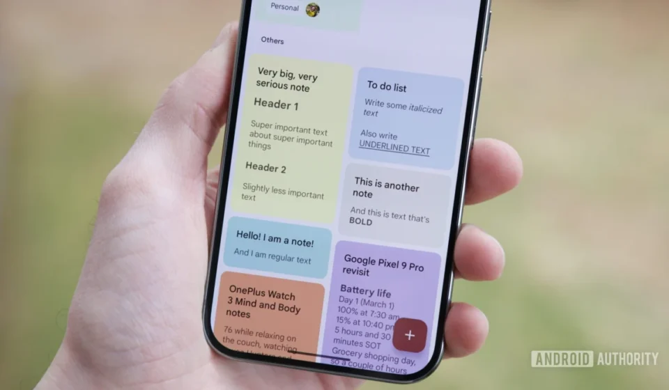
- Pinned Notes Display: Previously, pinned notes in Google Keep were grouped under a distinct "Pinned" header, visually separating them from other notes. The upcoming change indicates that pinned notes will now feature a small pin icon in their top-right corner. This modification is a design choice that aims to declutter the interface, reducing the need for explicit section headers and allowing for a more seamless visual flow of notes on the homepage. While minor, such UI refinements often contribute significantly to a perception of modernity and efficiency, aligning Keep with contemporary mobile design principles.
- Fading Text on Homepage Notes: Another observed UI adjustment is the gradual fading out of text within each note preview on the homepage. This visual effect, often used in mobile interfaces, can serve multiple purposes. Aesthetically, it can create a cleaner, less cluttered look, especially for longer notes whose content might otherwise abruptly cut off. Functionally, it subtly communicates that there is more content within the note without needing an explicit "read more" prompt, encouraging users to tap and expand the note for full details. This design choice contributes to a more polished and intuitive browsing experience.
These UI tweaks, combined with the new filters, suggest a holistic approach to improving Google Keep, focusing on both fundamental organizational tools and the overall visual and interactive experience.
The Enduring Appeal of Google Keep: A Brief History
To fully appreciate the significance of these potential updates, it is important to contextualize Google Keep within its history and the broader digital note-taking landscape. Google Keep was launched in March 2013, initially as a web application and Android app, with an iOS app following in 2014. Its inception was rooted in the demand for a simple, fast, and accessible note-taking solution, distinct from the more feature-rich but often heavier alternatives available at the time.
From its very beginning, Keep emphasized quick capture: users could jot down thoughts, create lists, record voice memos, or snap photos, all organized as "notes" that resembled digital sticky pads. Its signature colorful, card-based interface made it visually appealing and easy to navigate. A key strength was its seamless integration with the Google ecosystem, allowing notes to be accessed across devices, synchronized with Google Drive, and even transcribed from voice memos via Google Assistant.
Over the years, Keep has maintained its core identity as a lightweight, agile note-taker. While competitors like Evernote and Microsoft OneNote offered extensive formatting options, notebook structures, and web clipping capabilities, Keep focused on simplicity and speed. This approach resonated with a large segment of users who primarily needed a digital scratchpad for ephemeral thoughts, quick reminders, and basic checklists, rather than a comprehensive knowledge management system. Its free access and integration with personal Google accounts further cemented its widespread adoption.
Contextualizing Keep in the Digital Note-Taking Arena
The digital note-taking market is highly competitive, populated by a diverse array of applications catering to various user needs. On one end of the spectrum are robust solutions like Notion, Obsidian, and Roam Research, which offer powerful linking, database functionalities, and customizable workspaces, appealing to power users, knowledge workers, and those practicing "second brain" methodologies. In the middle are established players like Evernote and OneNote, providing a balance of advanced features (rich text, web clipping, extensive organization) and ease of use. At the simpler end, alongside Keep, are apps like Simplenote and Apple Notes, focusing on speed and minimal interfaces.
Google Keep has carved out its niche by being the quintessential "quick capture" tool. Its strengths lie in:
- Speed: Opening Keep and jotting down a note is almost instantaneous.
- Simplicity: The interface is clean, intuitive, and requires minimal learning.
- Cross-Platform Availability: Accessible on Android, iOS, web, and as a Chrome extension.
- Google Ecosystem Integration: Works seamlessly with Google Assistant, Calendar, and Drive.
- Free: All core functionalities are available without a subscription.
However, its simplicity has also been its perceived weakness. For users accumulating hundreds or thousands of notes, the lack of robust organizational features beyond basic labels and a search bar could lead to information overload. Finding a specific note from months ago, especially if it wasn’t diligently labeled, could become a cumbersome task. This is precisely where the newly discovered filters could bridge a critical gap, enhancing Keep’s utility without compromising its core lightweight appeal.
The Technical Lens: Understanding APK Teardowns
The information presented here originates from an APK teardown. An APK (Android Package Kit) is the package file format used by the Android operating system for distribution and installation of mobile apps. An "APK teardown" involves reverse-engineering this package file to examine its internal code, resources, and assets. Developers and tech journalists often conduct teardowns to uncover hidden features, upcoming functionalities, or insights into an app’s development direction.
It is crucial to understand the implications of an APK teardown:
- Work-in-Progress: Features discovered in an APK teardown are typically under development. They might be experimental, incomplete, or placeholders for future ideas.
- Uncertainty of Release: There is no guarantee that these features will ever be officially released to the public. Companies often test various ideas internally, and some may be scrapped before reaching a stable public build.
- Server-Side Activation: Even if the code for a feature is present in an APK, Google often uses server-side switches to activate new functionalities. This means users might not see the features even with the latest app version until Google decides to roll them out.
- Staged Rollouts: When Google does release new features, they often do so in a staged rollout, gradually making them available to a small percentage of users before a wider release. This allows them to monitor performance and gather feedback.
Despite these caveats, APK teardowns provide valuable early insights into a company’s product roadmap and strategic thinking. The manual enablement of these filters by Android Authority’s investigative team further validates their functional readiness, making their potential public release more plausible.
Implications for User Productivity and Experience
The introduction of these organizational filters carries significant implications for user productivity and the overall experience of using Google Keep.
- Reduced Friction in Note Retrieval: The most immediate benefit is the reduction in friction when searching for specific notes. Instead of typing keywords or scrolling endlessly, users can apply a relevant filter with a single tap. This translates to saved time and reduced frustration, especially for users who rely on Keep for daily tasks, meeting notes, or project management.
- Enhanced Information Architecture: The filters impose a new layer of information architecture on Keep. By allowing users to quickly view notes by recency, task orientation, collaborative status, or format, Keep becomes a more structured repository of information. This is a subtle shift that moves Keep slightly beyond being just a simple digital notepad, without transforming it into an overly complex system.
- Improved Task Management: The "To-Dos" filter, in particular, elevates Keep’s utility as a task manager. While Google has a dedicated "Tasks" app, many users prefer to keep all their quick notes and actionable items within Keep. This filter makes that integration more robust and explicit, potentially reducing the need to switch between multiple apps for related functions.
- Better Collaboration: For teams or families using Keep for shared lists and ideas, the "Shared" filter will dramatically improve access to collaborative content, fostering smoother teamwork and ensuring everyone is on the same page.
- User Interface Modernization: The UI adjustments, particularly the new pinned note indicator and fading text, contribute to a more modern and aesthetically pleasing interface. In an era where user experience is paramount, these refinements demonstrate Google’s attention to detail and commitment to keeping Keep visually competitive.
Google’s Strategic Vision for Its Productivity Suite
These potential updates to Google Keep align with a broader strategic vision from Google to continually enhance its suite of productivity tools, collectively known as Google Workspace (formerly G Suite). While Keep is often seen as a consumer-focused app, its integration into the Google ecosystem means improvements inevitably benefit Workspace users as well.
Google has consistently worked to create a seamless experience across its apps – Gmail, Calendar, Drive, Docs, Sheets, and Meet. Keep plays a crucial role as the lightweight, idea-capture component of this ecosystem. By making Keep more organized and efficient, Google strengthens its overall productivity offering, potentially encouraging users to remain within its ecosystem for all their digital needs, from communication to document creation and note-taking.
Furthermore, these enhancements could be a response to user feedback and the evolving demands of digital information management. As users generate more digital content, the ability to effectively organize and retrieve that content becomes critical. By adding these filters, Google is making Keep more capable of handling larger volumes of information without losing its signature ease of use. This could also be a strategic move to fend off competition from other note-taking apps that have started to offer more sophisticated organizational features.
Anticipating the Rollout and Future Prospects
While Google has not officially commented on the specific rollout timeline or confirmed these features, the presence of functional code in a public APK version suggests that these enhancements are well into their development cycle. Users can likely anticipate a server-side rollout in the coming weeks or months, following Google’s typical staggered release approach.
Looking ahead, these updates could signal a new phase of investment in Google Keep. Historically, Keep has received fewer major feature updates compared to other Google apps. The introduction of these robust organizational tools, coupled with UI refinements, might indicate Google’s intention to further evolve Keep, potentially exploring more advanced formatting options, deeper integration with AI functionalities, or even more complex organizational structures in the future. However, it is probable that Google will strive to maintain Keep’s core identity as a simple and fast note-taking application, balancing new features with its established minimalist philosophy.
The digital landscape for personal and professional productivity is dynamic, with constant innovation. Google Keep’s potential new filters and UI adjustments represent a significant step forward, promising to make one of Android’s most convenient note-taking apps even more powerful and user-friendly, solidifying its position as an essential tool in Google’s vast digital toolkit. The anticipation among users for these features to become widely available is undoubtedly high, given the clear benefits they offer for daily information management.