





Android Auto Set for Major Visual Overhaul, Signified by Fresh Green Icon and Material 3 Design Philosophy

Android Auto is poised to undergo a significant transformation in the coming months, promising a more sophisticated and intuitive user experience characterized by fluid design elements, refined aesthetics, enhanced widget support, and the long-anticipated integration of video playback capabilities. This comprehensive update aims to address criticisms regarding its visual parity with competing platforms like Apple CarPlay, positioning Android Auto for a new era of in-car infotainment. While the precise launch date for this extensive rollout remains undisclosed, initial indicators of this impending evolution are already surfacing, most notably through the introduction of a revamped Android Auto application icon, which subtly but significantly signals Google’s renewed commitment to the platform.
The unveiling of the new icon, observed with version 17.6.663424 of Android Auto, serves as the vanguard for these broader changes. This seemingly minor aesthetic adjustment carries substantial symbolic weight, hinting at a strategic shift in design principles and a deeper integration into Google’s overarching brand identity. The immediate and most striking alteration in the icon is the departure from its traditional blue hue, transitioning to a distinct shade of green. This particular green bears a striking resemblance to the iconic color associated with the Android bugdroid mascot, fostering a more cohesive visual language across Google’s mobile ecosystem. Beyond mere brand harmonization, this color choice could also subtly allude to a broader industry trend towards environmentally conscious and predominantly electric modes of transport, aligning Android Auto with the future of automotive technology.
Further scrutiny of the redesigned icon reveals a series of nuanced refinements that echo Google’s contemporary Material Design philosophy. The new icon features distinctly rounder corners, a design characteristic that extends even to the previously sharper edges of the upward-pointing arrow, which evokes the imagery of a paper airplane. While the variations in shadow application across both elements remain subtle, a more pronounced padding has been introduced between the green and white components of the logo, creating a cleaner, more defined separation. This emphasis on soft curves and clearer visual hierarchy is a hallmark of Material 3, Google’s latest design language, which prioritizes user comfort, visual accessibility, and adaptive interfaces. Interestingly, Google has opted for solid colors in this iteration, a departure from the gradient applications seen in some other recent Google application icon updates. This deliberate choice for Android Auto might suggest a prioritization of clarity and immediate recognition within the context of a car’s dashboard, where visual distractions need to be minimized for driver safety.
The Evolution of Android Auto: A Journey Towards Seamless Integration
To fully appreciate the significance of this impending overhaul, it is essential to contextualize Android Auto within its historical trajectory. Introduced by Google in 2015, Android Auto was conceived as a platform designed to extend the functionality of an Android device into a car’s dashboard infotainment system. Its primary goal was to provide drivers with safe and easy access to navigation, communication, and media services while minimizing distractions. Initially, the system relied heavily on wired USB connections, projecting a simplified, car-optimized interface from the user’s phone onto the vehicle’s display. Over the years, Android Auto evolved, introducing wireless connectivity, expanding app compatibility, and undergoing several design iterations to improve usability.
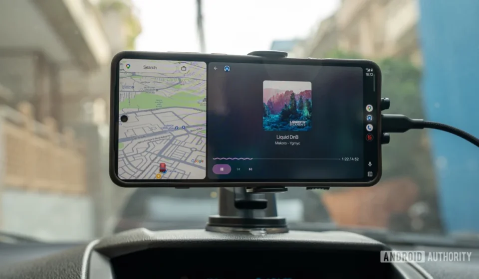
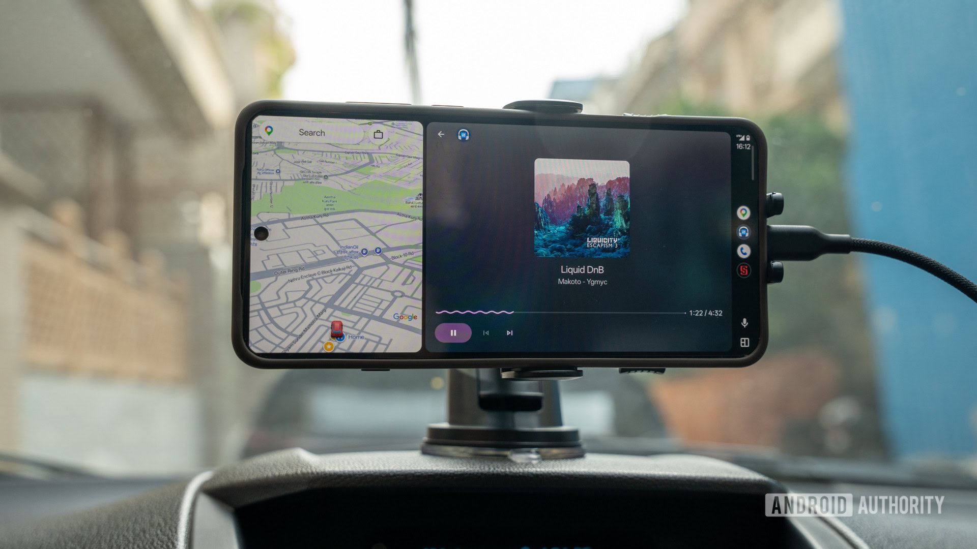
One of the most significant previous updates was the "Coolwalk" redesign, which rolled out extensively in early 2023. Coolwalk brought a split-screen interface, allowing users to view navigation alongside media controls or other relevant information simultaneously. This update was a direct response to user feedback and a strategic move to offer a more dynamic and information-rich dashboard experience, akin to features found in Apple CarPlay. The continuous refinement of Android Auto underscores Google’s commitment to maintaining its relevance and competitive edge in the rapidly evolving in-car technology landscape, where the digital experience is becoming as crucial as the driving performance itself.
Anticipated Features of the Major Makeover: Bridging the Gap with Competitors
The current icon update serves as a powerful harbinger for the comprehensive software upgrades first hinted at during Google I/O 2026. The promised enhancements are multifaceted, targeting both aesthetic appeal and functional utility. Central to this transformation is the deeper integration of Material 3 design principles, which will manifest as more fluid animations, fewer rigid geometrical shapes, and a greater emphasis on dynamic color and typography. This shift aims to create a visually appealing and highly responsive interface that feels more native to the vehicle and more integrated with the user’s overall Android experience.
Perhaps the most eagerly awaited feature is the introduction of native widget support. Widgets have been a cornerstone of the Android mobile experience, offering glanceable information and quick access to app functionalities without needing to fully open the application. Bringing this functionality to Android Auto will allow for unprecedented levels of personalization and efficiency, enabling drivers to customize their dashboard with quick access to weather, calendar events, smart home controls, or other relevant data, all without compromising driving focus.
Another monumental addition is the long-requested capability for video playback. While this feature is primarily intended for use when the vehicle is stationary – for instance, during charging breaks in an electric vehicle, or while waiting in a parked car – its inclusion significantly expands Android Auto’s entertainment capabilities. This move directly addresses a significant perceived deficiency when compared to rival systems, where passengers might have access to streaming content. This could involve integration with popular streaming services, transforming the car into a more versatile entertainment hub during downtimes.
The overarching goal of these updates is to elevate Android Auto’s visual and functional standing to not only match but potentially surpass its competitors, particularly Apple CarPlay. For years, a segment of users has expressed a preference for CarPlay’s perceived visual polish and seamless integration. With this forthcoming overhaul, Google is directly addressing these concerns, aiming to eliminate any lingering reasons for such complaints and ensure Android Auto offers a premium, intuitive, and visually cohesive experience.
The Strategic Significance of Color and Design: Beyond Mere Aesthetics
The transition of the Android Auto icon from blue to green is more than a simple color swap; it is a carefully considered strategic decision. The new green shade is almost identical to the specific "Android Green" associated with the Android bugdroid logo, a move that reinforces brand recognition and creates a more unified visual identity across Google’s diverse product portfolio. This consistency helps users immediately identify the app as a core part of the Android ecosystem, fostering a sense of familiarity and trust.
Furthermore, the inference that the green color could signify a move towards "greener, predominantly electric, modes of transport" is highly pertinent in the current automotive landscape. The global automotive industry is undergoing a monumental shift towards electric vehicles (EVs) and sustainable mobility solutions. By subtly aligning its branding with this environmentally conscious trend, Google positions Android Auto as a forward-thinking platform that is in sync with the future of driving. This not only resonates with a growing segment of eco-conscious consumers but also future-proofs the brand’s image as the industry continues its pivot away from fossil fuels.
The nuanced design changes, such as rounder corners and increased padding, are direct manifestations of Google’s Material 3 design language. Material 3 emphasizes adaptive design, dynamic color, and a more human-centered approach to user interfaces. These softer, more fluid elements contribute to a less rigid and more inviting visual experience, which is particularly important in an in-car environment where interfaces should feel natural and unobtrusive. The aim is to reduce cognitive load, making the interface easier to glance at and interact with, thereby enhancing safety and user comfort. The deliberate choice of solid colors, as opposed to gradients, further reinforces the principle of clarity. In a dynamic driving environment, high contrast and distinct elements are paramount for quick information processing, and solid colors often provide better legibility than complex gradients.
Rollout and Availability: Google’s Phased Approach
While the exact release date for the full suite of Android Auto enhancements remains unspecified, the appearance of the new icon in version 17.6.663424 signals that the rollout is imminent, if not already underway for a select group of users. Google typically employs a phased rollout strategy for its major software updates, releasing new versions to a small percentage of users initially before gradually expanding availability. This approach allows the company to monitor performance, identify and address bugs, and gather user feedback in a controlled environment. The observation that "only a handful of us see it currently" is consistent with this standard operating procedure, indicating that a wider release is expected shortly.
This phased deployment ensures a smoother transition for the vast Android Auto user base, which spans millions of vehicles globally. Given Google’s recent focus on major hardware launches, such as the rumored "Googlebook," the company is now expected to shift its resources and energy towards delivering these promised software upgrades, which are crucial for maintaining user satisfaction and ecosystem loyalty.
Broader Implications and Market Impact: The Future of In-Car Infotainment
The forthcoming Android Auto overhaul carries significant implications for both Google and the broader automotive technology market.
Firstly, the enhanced visual appeal and feature set, particularly video playback and robust widget support, will intensify the competition with Apple CarPlay. By directly addressing past criticisms and offering parity or even superiority in certain areas, Google aims to solidify Android Auto’s position as the preferred in-car platform for Android users and potentially attract new users from across the smartphone spectrum. This ongoing "ecosystem battle" in automotive infotainment benefits consumers by driving innovation and improving user experience.
Secondly, the deeper integration of Material 3 design and the potential for advanced AI capabilities, such as those powered by Google’s Gemini, will further embed Android Auto within Google’s expansive ecosystem. The original article mentions Gemini integration in Maps and Android Auto, indicating a strategic push to leverage AI for more personalized, proactive, and intelligent assistance within the vehicle. Imagine Gemini suggesting optimal routes based on real-time traffic and your calendar, or proactively managing your media preferences based on your driving habits. This strengthens Google’s hold on the connected car experience, ensuring that users remain within its suite of services even behind the wheel.
Thirdly, the introduction of features like widgets and video playback will open new avenues for developers. A more versatile and capable platform will encourage third-party developers to create innovative applications tailored for the in-car environment, expanding the utility and appeal of Android Auto beyond its core navigation and communication functions. This could lead to a richer app ecosystem, offering more choices and specialized tools for drivers and passengers.
Finally, these updates contribute to the ongoing evolution of the in-car experience. As vehicles become increasingly digitized and autonomous, the infotainment system plays a critical role in how users interact with their cars. Android Auto, with its renewed focus on design, personalization, and advanced features, is positioning itself at the forefront of this transformation, aiming to make the time spent in a vehicle more productive, entertaining, and seamless. While functionality changes are not immediately apparent with the icon update, the continuous monitoring of the interface will undoubtedly reveal the full scope of Google’s ambitions for Android Auto in the coming weeks and months.
In conclusion, the subtle yet significant redesign of the Android Auto icon serves as a clear herald of a much larger, strategic overhaul. This transformation is not merely cosmetic; it represents Google’s renewed commitment to enhancing the in-car experience, striving for visual and functional parity with competitors, and integrating its advanced AI capabilities more deeply. With a fresh aesthetic rooted in Material 3 principles and the promise of highly anticipated features like widgets and video playback, Android Auto is poised to redefine its role in the connected car landscape, offering users a more intuitive, personalized, and engaging journey. The shift to a vibrant green icon is more than just a brand refresh; it’s a visible declaration of intent, signaling a greener, smarter, and more integrated future for in-car technology.